
The P/E Line vs Its Own History
Why a P/E only means something against the company's own past — and how to read the Quarterly P/E chart.
A P/E without context is just a number
The price-to-earnings ratio is one of the most widely cited valuation metrics in equity analysis. Divide the stock price by earnings per share and you get a number — but that number is almost meaningless without the right comparison. Comparing a P/E of 35 to a market average or to a company in a different sector tells you very little, because businesses differ profoundly in growth rate, capital intensity, earnings volatility, and competitive dynamics.
A fast-growing technology company reinvesting most of its earnings will typically trade at a much higher P/E than a mature utility with stable but slow-growing cash flows. Comparing their P/E ratios as if they were the same kind of number is like comparing a marathon pace to a sprint pace — the units look the same but the context is entirely different.
The comparison that is genuinely informative is the company's P/E against its own history. If a company has historically traded between 18 and 28 times earnings and is now trading at 40, that stretch deserves investigation. If it is trading at 15, that compression also warrants attention. The company's own historical range encodes how the market has priced its specific growth profile, risk, and earnings trajectory over time — context that a cross-company comparison loses entirely.
The Quarterly P/E chart
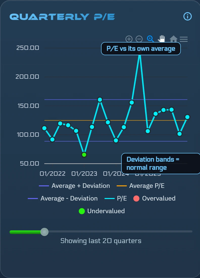
On each stock page, ŷRobot's Quarterly P/E card plots the quarterly P/E ratio as a line over time, paired with two reference overlays: a multi-quarter moving average of that company's own P/E history, and deviation bands that mark the range above and below the average where the ratio has historically spent most of its time.
Reading the chart is a matter of position. When the P/E line is running above the upper deviation band, the stock is trading at a premium to its own historical average — pricier than it has typically been on an earnings basis. When the line is inside the bands, it is in the historically normal range. When it is below the lower band, it is trading at a discount to its own history.
Above the band is not automatically bad, and below the band is not automatically a positive signal. A P/E running above its average might reflect a genuine improvement in the business — better margins, a new product cycle, or an improved competitive position that the market is correctly pricing in. A P/E below its average might reflect a deteriorating business rather than an underpriced one. The chart provides visual context; judgment about whether the deviation is warranted still requires understanding what is happening in the underlying business.
How it feeds the AI score
The P/E-history component carries an 8% weight in the AI score — one input among eight, making it a supporting signal rather than a dominant driver. The weight reflects a deliberate calibration: P/E history is informative but can be distorted by one-time earnings events, accounting choices, or cyclical earnings troughs and peaks that make a single quarter's ratio unrepresentative.
By incorporating this signal at 8%, ŷRobot treats it as a useful context signal — a flag when valuation is historically stretched or compressed — without letting a single quarter's ratio swing the composite dramatically. Combined with the fair-value gap (30%), return forecast (20%), and chart signal (15%), the P/E-history component adds a historical-pricing dimension that the other signals do not directly capture.
When the P/E signal points in the same direction as the higher-weight signals, it reinforces the composite. When it diverges, it adds nuance — a signal worth examining even if it does not override the broader picture.
Where to find it
The Quarterly P/E chart appears on every stock page in the dedicated Quarterly P/E card. The card shows the full history of the quarterly ratio, the multi-quarter average overlay, and the deviation bands — giving you an immediate visual read on whether the current P/E is historically stretched, compressed, or in the normal range for this specific company.
Because the chart is anchored to each company's own history rather than a market-wide benchmark, it remains meaningful regardless of sector. A P/E that looks elevated on a sector average might be normal for this company; one that looks modest might be elevated by that company's own standards. The historical framing keeps the comparison honest.
Try it on a real stock
See ŷRobot's P/E Line vs Its Own History analysis on any U.S. stock — free, no account needed.
Analyze a Stock FreeFrequently asked questions
Is a P/E above the historical average always bad?
No. A stretch above the average band is a flag to investigate — growth, margins, or the business mix may have changed. The chart provides context, not a verdict.
ŷRobot analysis is AI-generated and quality-gated; nothing on this page is investment advice.