
Reading a Stock Page
The stock page in reading order: scorecard first, then value, forecast, and P/E history.
Start at the AI Scorecard
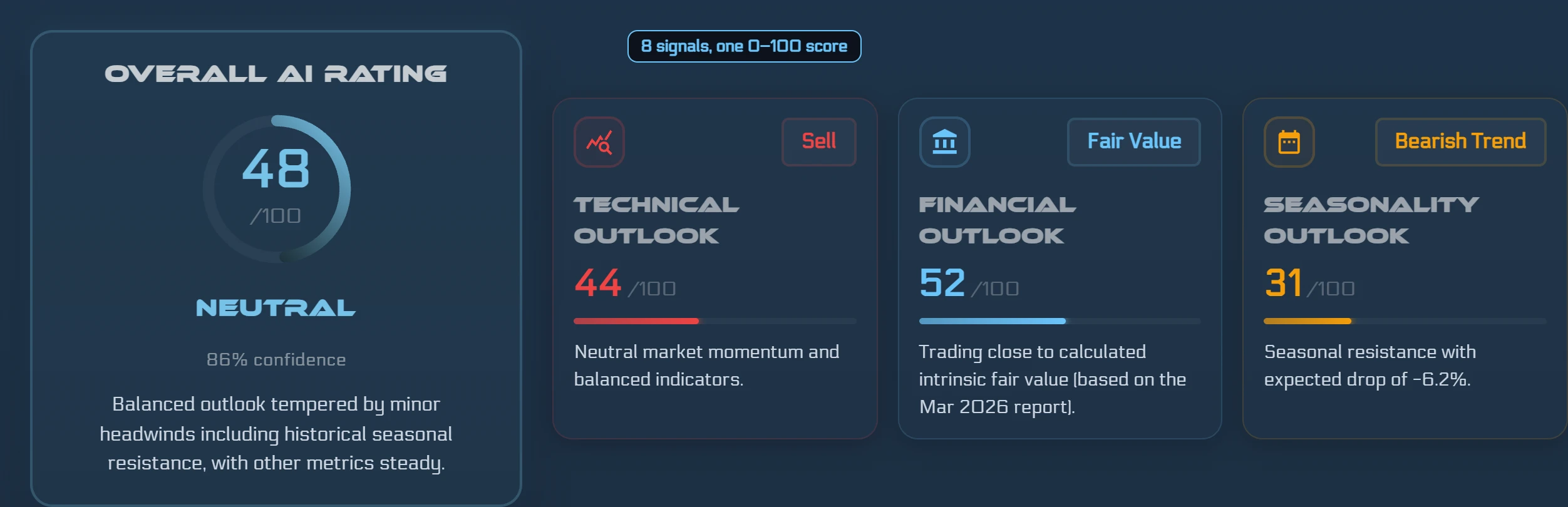
The first thing you see on a stock page is the AI Scorecard. It displays the composite AI score (a number from 0 to 100), the direction (positive or negative), and a confidence level. Below the headline numbers, the scorecard breaks out three pillars — Technical, Valuation, and Seasonality — so you can see at a glance which analytical areas are contributing to the overall reading. The 'Add to Watchlist' button lives in the scorecard header, making it easy to start tracking a name right from this card.
The score is an agreement gauge across eight weighted signals — it tells you how consistently multiple independent analytical lenses point in the same direction. A high score means most signals agree; a low score means they do not. That agreement is probabilistic context, not a recommendation.
The Fair Value card
Below the scorecard, the Fair Value card shows two numbers side by side: the current market price and the model-estimated value labeled 'ŷRobot Fair Value (6-month model estimate).' Between them sits the Valuation Gap percentage — the difference between the estimate and the current price, expressed as a share of the current price.
The '6-month model estimate' label tells you what the number is: where the model expects the stock's value to be roughly six months after its latest financial report. The estimate is derived from a CatBoost regression model trained on roughly 40 fundamental, growth, cash-flow, and price-momentum inputs, and because those inputs include the current price, the estimate is a forecast rather than an intrinsic valuation. A positive Valuation Gap means the model's estimate sits above the current price; a negative gap means it sits below. Both readings are probabilistic — the model can be materially wrong, especially during rapid business or market changes.
Read the gap as context, not as a timing signal. It summarizes where the model, based on the most recent financial data, places the estimated fair value relative to what you would pay today.
Forecast and P/E (TTM) charts
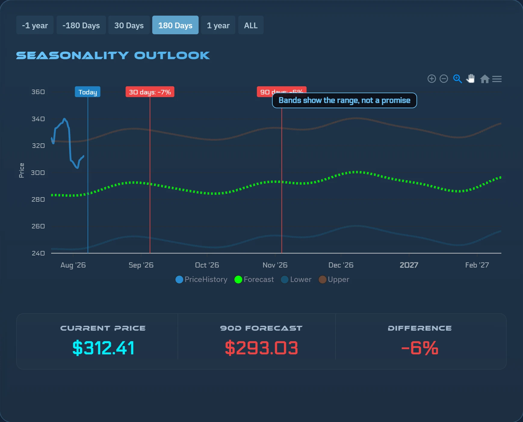
The forecast chart shows a price path with upper and lower bands. The bands represent the model's range of estimated outcomes rather than a single-point prediction, making the uncertainty visible rather than hiding it in a number. The chart gives you a sense of both the direction and the spread the model sees from current data.
The P/E (TTM) card plots the stock's trailing-twelve-month price-to-earnings ratio at each quarterly report as a line, set against its own multi-quarter average, and adds a daily point for today's price over the latest trailing earnings. Deviation bands around that average show how far the current P/E sits from its own historical norm — above the band means the stock is trading at a historically elevated earnings multiple for itself; below means the opposite. This card is a reference for how the current valuation compares to the stock's own P/E history, not a comparison to other companies.
Getting there
You can reach any stock page by searching for a symbol from the US Equities section of the app. The Smart Screener also links directly: click any symbol in the screener grid to open its full stock page. Sign-in is required to view stock pages.
The order in which the cards appear on the page — Scorecard, Fair Value, Forecast, P/E (TTM) — follows the logic of starting broad and narrowing down. The scorecard gives you the composite signal; the value card puts price in context; the charts let you look at the shape of both the forecast range and the P/E history in one view.
Try it on a real stock
See ŷRobot's AI analysis on any U.S. stock — free, no account needed.
Analyze a Stock FreeŷRobot analysis is AI-generated and quality-gated; nothing on this page is investment advice.